Luke keast

Luke Keast

Director of Product

Show me more

About me

Hello! I'm Luke, a London based Product specialist.

I have over 10 years experience creating valuable experiences for global blue chip brands

Aviva Investors

Aviva Investors wanted to totally reimagine their Client Reporting product

The solution comprised of a new digital report, interactive charts and in-depth analysis tools.

Toyota

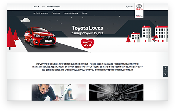
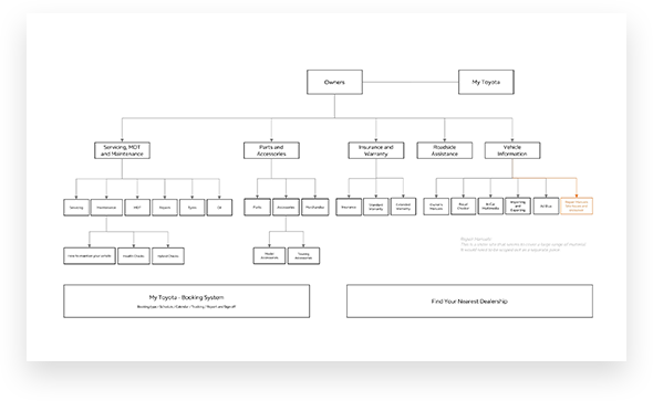
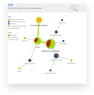
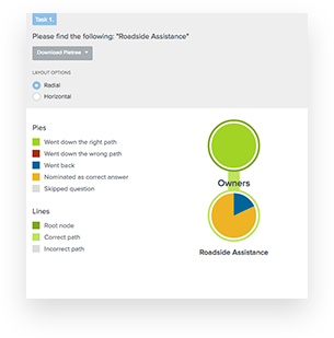
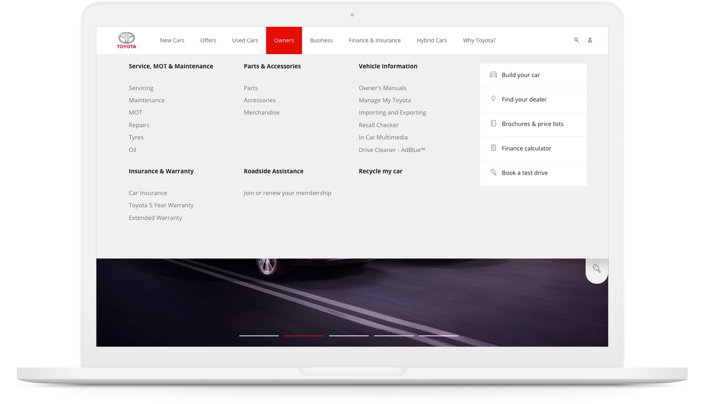
Toyota wanted to improve the usability of their aftersales and finance products

I conducted extensive user research, analysis, design & testing to deliver a robust solution

Servicing Toyota

The challenge

Toyota wanted to know whether users understood the language they used on their aftersales and finance pages

They also wanted to know if users were able to find what they were looking for

User surveys and analytics data quickly revealed that there may indeed be a problem for customers in understanding and navigating content

The different types of finance really need explaining properlyI have no idea what those [types of finance] are I might have that one... I’m not sureWhat does ‘Access Toyota’ mean?

Research

In order to better understand the navigation issues, I recruited real customers who had recently purchased a Toyota and conducted a card sorting exercise with them

The users further confirmed what the macro data had suggested and provided the foundation for an alternative, clearer navigation structure

A deeper dive into analytics data showed specific journeys with a high drop-off rate

The solution

Based on the reasearch findings and on the original analytics data, I validated a new proposed navigation structure using TreeJack, against the original structure

The new navigation made use of words that Toyota customers were more familiar with and grouped destinations into more logical categories

The test data revealed a dramatic improvement in the task success rate, using the new navigation

Overall task success was up from 56% with the old structure, to 96% with the new structure

Before
56% success
After
96% success


Arcadia

A large scale responsive Product design project for all 7 Arcadia brands globally

I analysed research data, completed an End-to-end user journey map & produced over 150 high-fidelity wireframes using Sketch

Fashion designer

The challenge

The Arcadia brands had been using an old desktop plaform which was maintained entirely separately from a modern mobile platform

I was asked to transform the mobile site into a single responsive platform, making use of new technologies and providing a framework suitable for all 7 Arcadia brands

I was not able to scroll down to see the whole image which puts me off from buying... The 15% off promotion codes don’t work!!!There are too many bars at the top and bottom, and I cannot get a full length view of any of the items

Research

Customer surveys identified a huge amount of jarring experiences which were impacting conversion and causing frustration for users

Previously conducted user testing also highlighted opportunities for the desktop experience

Mapping it out

After speaking with each of the brand representatives and analysing every page of the mobile websites, I was able to map out the user flows with an augmented desktop view

This included numerous page and module variants, incorporating the unique needs for each brand

The solution

Using Sketch I created over 150 high fidelity wireframes, covering every scenario for all 7 brands

By working closely with the development teams, I was able to ensure that UI and IxD standards followed through to the build

BBC

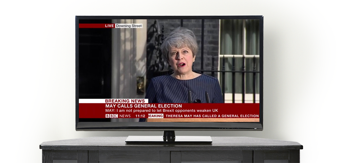
The week of the 2017 General Election, the BBC News website reached over 100 million unique users

Together with cross functional teams I was able to define the visual storytelling for the Election results working together with researchers and journalists

Broadcasting data

A snap election

For big stories, the BBC is the most trusted source for accurate information in the UK

In April 2017 Theresa May called a surprise snap election, for the BBC this meant less than two months to deliver a comprehensive broadcast on TV and online. My challenge was to explain the results of the Election using maps and charts

For me personally it’s a lot [of content], I don’t think I would read all of this Visually the [map] image looks so different from the figures I would like to see more party information for my constituency

Research

User interviews revealed that some people didn't understand why the colours in the charts didn't seem to correlate with the results map which was shown geographically. Users also found it difficult to find their local area by using the map

Research data from the last Election showed that most people were focussed on headlines and only had a casual interest in detailed results, therefore welcomed charts that were easy to understand at a glance

Ideation

In the past charts had been too complex and users found maps to be confusing in some cases, I therefore analysed competitor solutions for similar challenges and sketched some simpler solutions for maps and charts, while still retaining accurate information that users expect from the BBC

By testing thesse with users and validating the data with subject media experts within the BBC I was able to design a more user friendly solution while still retaining accurate and relevant data

The solution

The final solution was much more usable; interactive maps now had the ability to enter your town or postcode to find local results, and the results maps were presented in both geographic and hexagonal style (where each constituency is shown at the same size)

Charts showed very simply where votes had moved from one party to another broken up into digestible chunks and User testing showed that the new results were very well received by the audience

See the result

Engie

The €70bn energy giant wanted to develop a brand new website to supply energy to the public

By conducting user interviews, mapping out user journeys & testing a complex functional prototype made in Axure, I was able to design & validate a slick user experience

Watch User testing

The challenge

TBC

TBC

quote

Research

TBC

TBC

Mapping it out

TBC

TBC

The solution

TBC

TBC

Luke has the rare ability to present things in a simple way, even when dealing with complex user journeys and interactions Melvin Simpson
Senior Consultant, Biglight
Luke is everything you want - smart, knowledgeable, inquisitive, pro-active, creative yet pragmatic Matt Le Gresley
Head of UX, Jellyfish
Luke joined Arcadia and instantly hit the ground running bringing a wealth of experience and a healthy dose of enthusiasm Natascha Piechowski
Group Digital Product Owner, Arcadia

Get in touch!


Download PDF